"Imaging Lazarus" essay included in the SUPERNATURE issue of DRAIN

drain_cover_15_supernature

Imaging Lazarus: The Undead in Contemporary Painting

Steve Locke

I want to avoid the obvious discussion of painting being dead.  It’s not.  Rather, painting has been killed several times and has been brought back to life by a certain kind of belief, or faith in it.  This faith sustains painting as a practice, but recently there has been a kind of representation of the body, the “undead” body in painting that I think has a lot to do with the history of painting, but an attempt to re-inscribe the art in general and body specifically as a site of political agency.

It bears an investigation of the story of Lazarus to get a sense of what I am talking about here.  The tale is found in the Gospel of John.  Many people focus on Jesus’s act of raising Lazarus from the dead (he had been entombed for four days) as a pre-figuring of his own resurrection.  It is that, no question.  But there are other elements of the story that I think are often overlooked.

Please visit the DRAIN site to read the rest of the essay.  Click HERE.

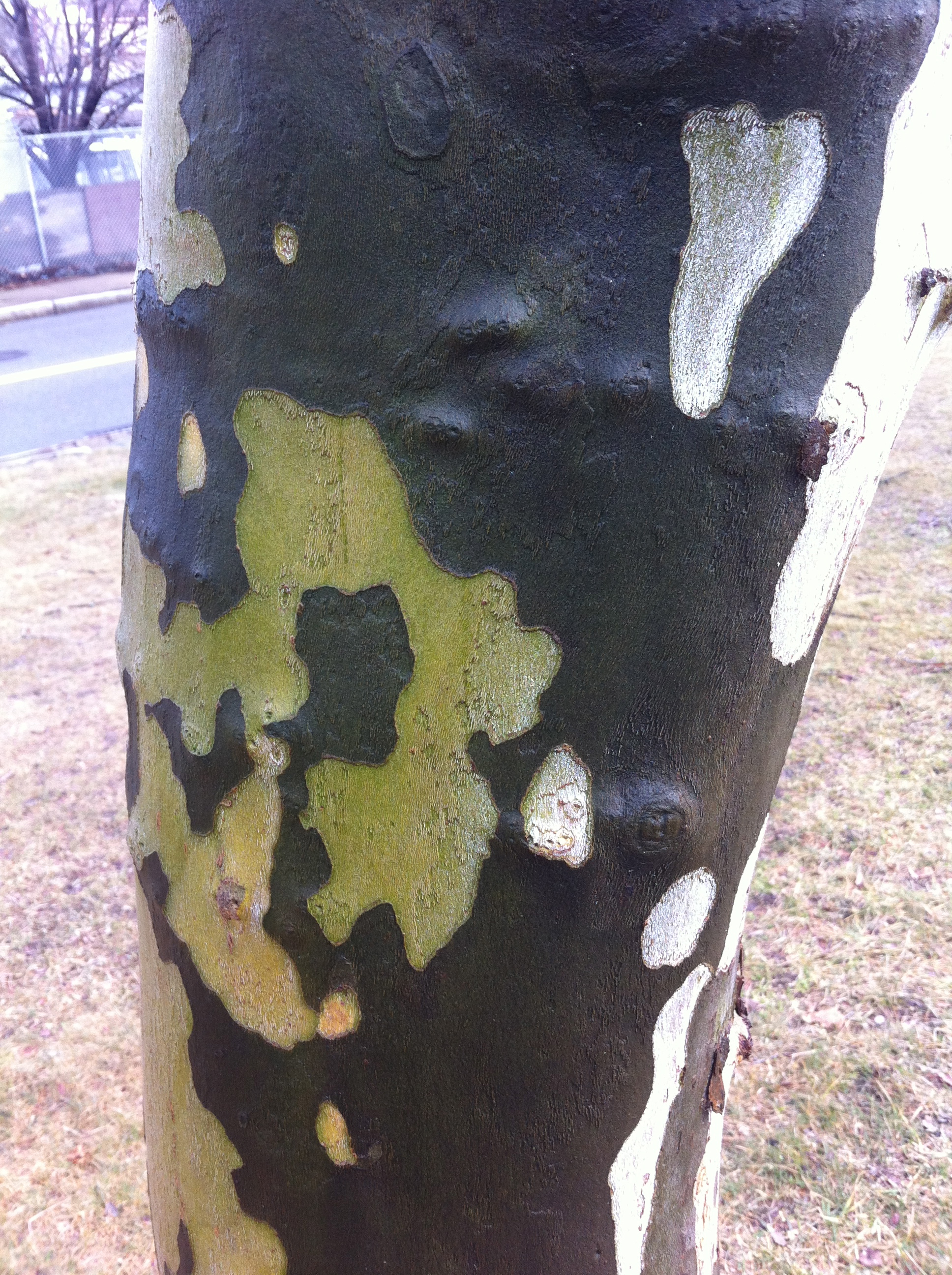
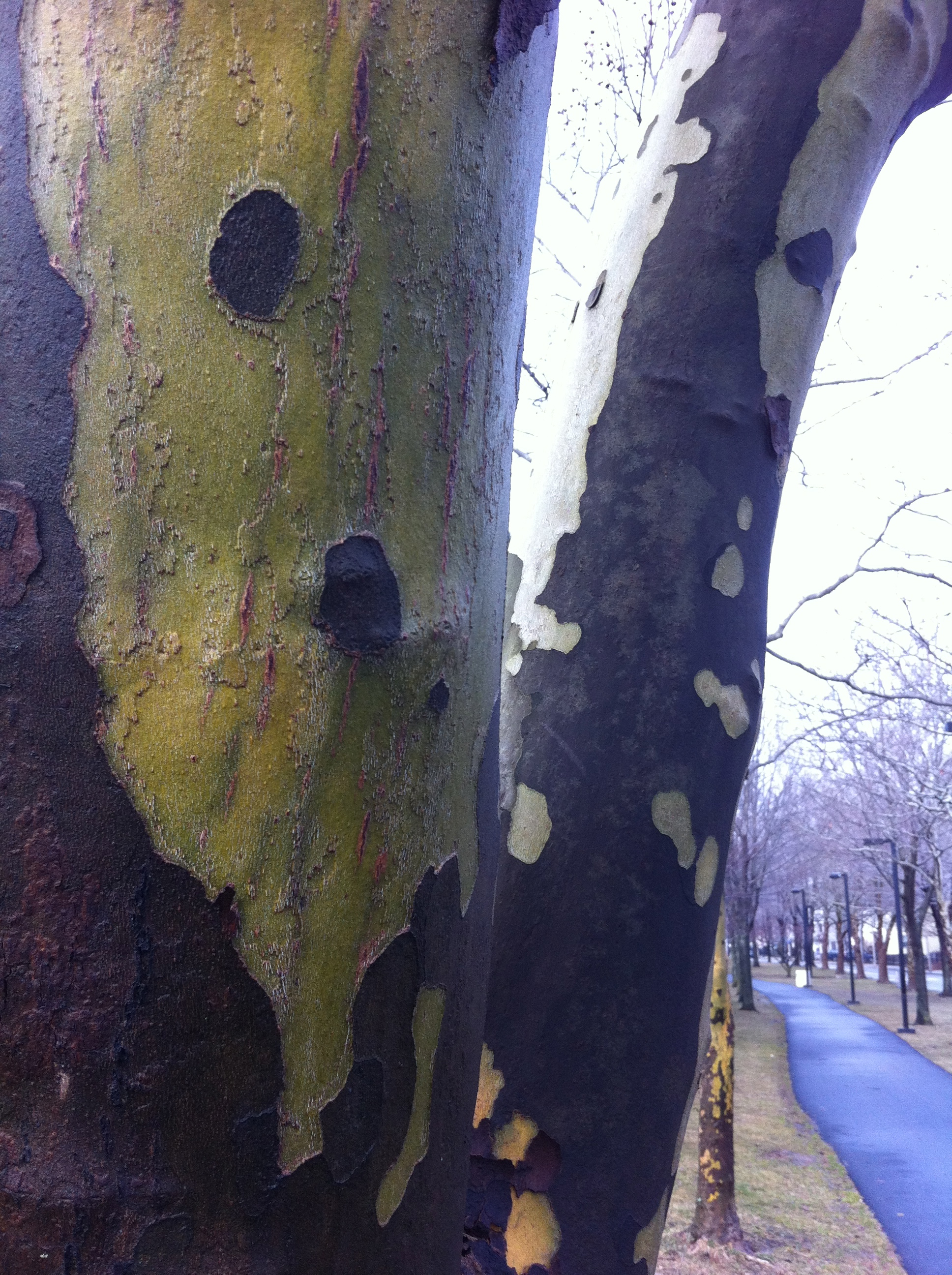
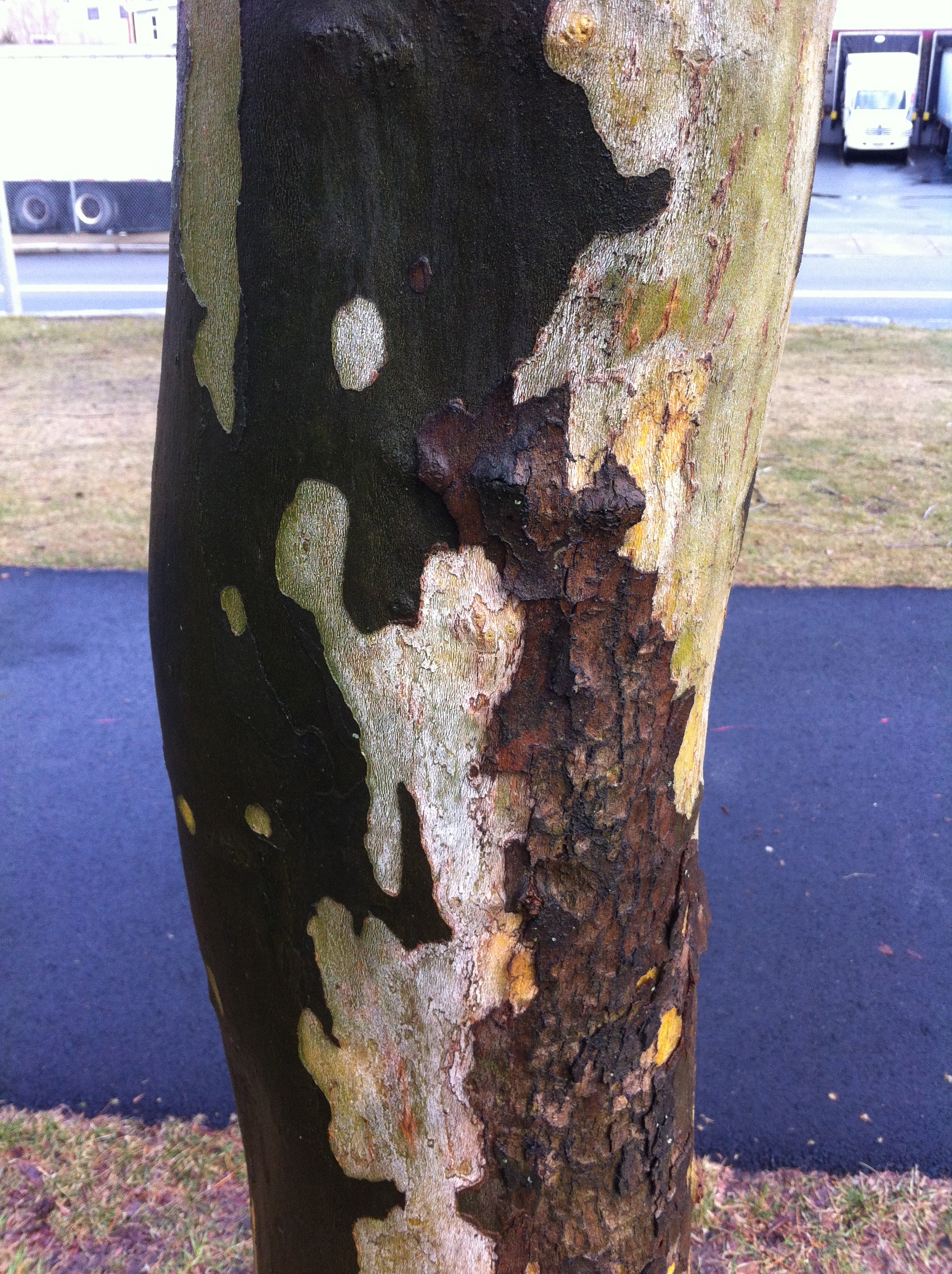
Walking for color (and some Beeches for real this time)

I am thinking about my palette for paintings and I have been doing a lot of walking lately.

Now, I am not the sort of person who has ever been remotely interested in painting the landscape.  Seriously, it was something I did when I was in school but I was never very good at it.  Then I went to Skowhegan and I met amazing painters who were really committed to painting the landscape (like Ellen Altfest, Frank Meuschke,  Lois Dodd, and Yvonne Jacquette) and I knew I didn't have that kind of commitment in me for the landscape.

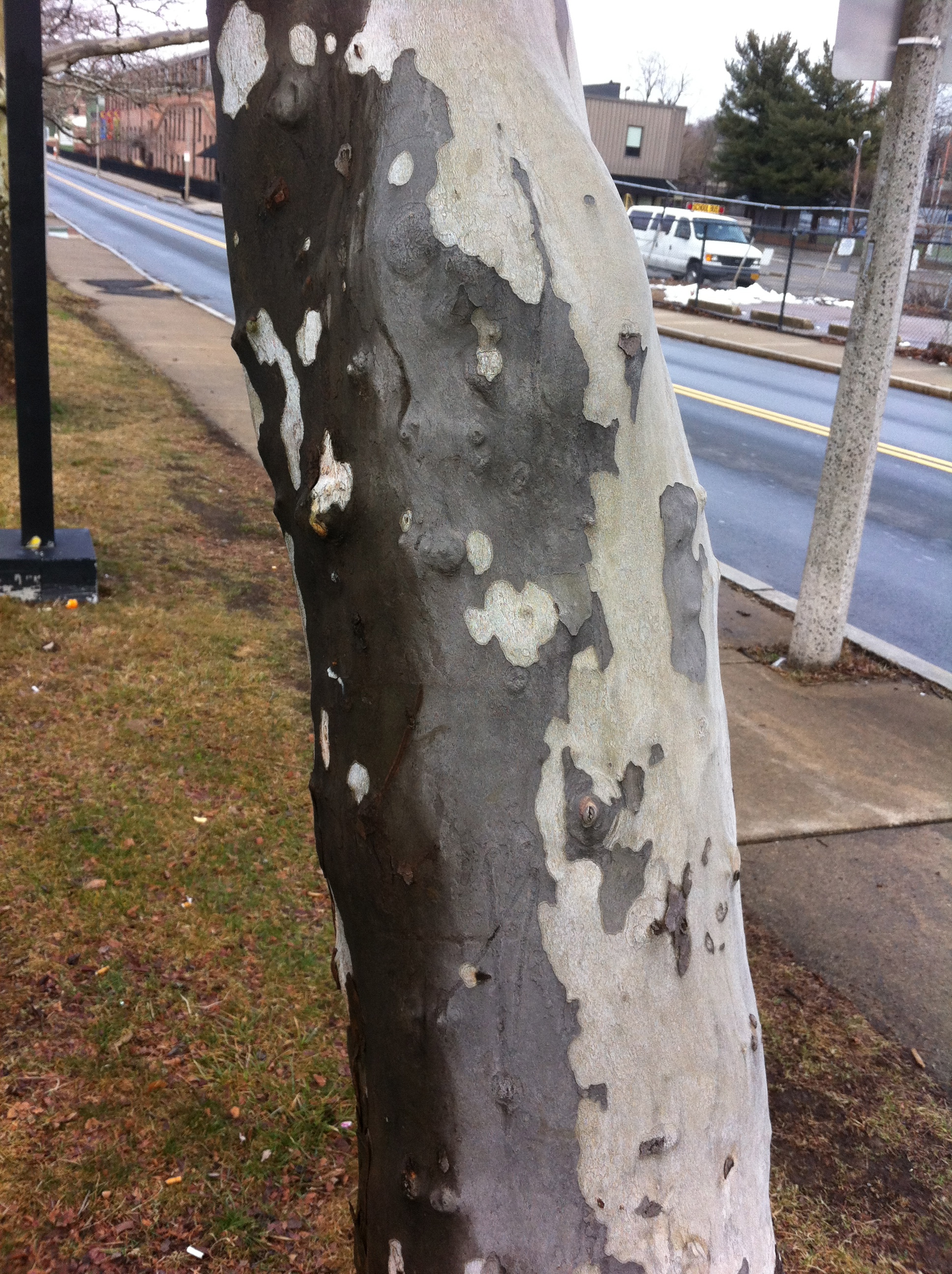
I will say that the color in the landscape has become very urgent for me lately.  Specifically, the way green is becoming a situation for color.  I start thinking what it could mean to formulate a painting where varieties of green are the basis for the color relations. So I've been walking in the landscape a lot lately and looking at trees. And mixing that color when I get home.

Who is better than Stephen Tourlentes?

Well, the short answer is nobody, and if you don't believe me you really need to go see his show OF LENGTH AND MEASURES at Carroll and Sons. These pictures marry the poetics of the sublime with the hard reality of the administration of death. He makes clear the beauty of these landscapes comes at the expense of (and in fact is due to) the luminous presence of the prison complexes that house and administer death in the name of the people. That he is a brilliant technician is well on display in this exhibition but the thing that stays with me is that Tourlentes has used his considerable talents and technical acumen to focus on a part of contemporary life we care not to consider nor do we want to know how we benefit. (Many prisoners are stripped of their voting rights. Some of these complexes house thousands of prisoners, increasing the state's population and thus their political representation. Michelle Alexander probes this in THE NEW JIM CROW.) Pictured is an image of Ardmore, Alabama, Alabama Death House, 2004. Trust me, this cheesy jpg is nothing compared to Tourlentes's actual photos. He was my favorite to win the Foster Prize last time around. This exhibition shows why he is one of the best artists working right now. I'm glad he is really starting to get his due. Image

BAGLY Prom photos Gallery Kayafas

Social documentarian Zoe Perry-Wood has a gorgeous show at Kayafas - pictures of BAGLY kids going to their prom.  These sweet and participatory portraits and images of kids getting together to celebrate made my heart sing. It was also really great to see photos of LGBT kids just being kids and Perry-Wood photographs them acting like the beautiful kids they are.  Here are photos of teenaged queer couples and dancers and lovers made without exploitation or salacious probing.  They whole show feels like a gift from Perry-Wood to the kids and a gift from the kids to us.  How different my life may have been if I had walked into this gallery as a teenager. Image

Beckmann makes other painters look like scrubs

20120407-054736.jpg A detail from the glorious "Self-portrait in a Tuxedo" (1927) on view at the Harvard Museums weird ass "greatest hits" installation at the Sackler. Everyone is usually kvelling over his use of black but the joy is the chromatic shadows in the face. You can see this painting and then go look at the Poussin's upstairs and wonder how people could ever think that making a shadow was a matter of adding black.

Have I stayed too long at the fair?

Armory weekend in New York. So much to see. Here's some things I liked. Gran Fury: READ MY LIPS at 80WSE Gallery, Steinhardt School Department of Art and Art Professions at NYU. An amazing show of powerful and desperate work that spoke to a desperate time. It makes me realize how close we were when we all were dying.

[slideshow]

Brian Bress at Cherry and Martin at the Armory Show. I love the way he manipulates the space of video. His work expands and contracts as things enter and leave the screen. The hilarity of his work is exacerbated by his craft with all the elements of video, performance, and production. The yellow border on his video at Armory was a container of delight.

There was some painting at the Armory that really was terrific. There wasn't a lot of it, but Tomory Dodge really made up for the lack of sophisticated painting. The show at CRG was installed beautifully and the paintings really overwhelmed you with their rich application and independence. Each painting provided a different visual structure; some related to landscape, some to atmosphere, and so on. There were no nostalgic references or attempts to recreate a certain moment in painting's history. Modestly sized and confidently executed, Dodge showed that abstraction could be lyrical, alive, and beautiful and still carry within it ideas about collapse and entropy.

VOLTA is my favorite fair. It's smaller than Armory and it has only one artist per booth. You get a broader view of the work of anartist at this fair and there were a lot of great things to see here.

Matt Rich at Samsøn. The work is much more uncanny. You really can no longer tell how it is made and the choice of color makes the experience of looking richer and more rewarding. Rich is making work that is stripped of all its support and still refuses to collapse.

I also really need to say that the Boston Galleries really were awesome at VOLTA. I'm not just saying that to suck up to anyone. I feel that Rich, Andrew Masullo at Steven Zevitas and Jeff Perrott at LaMontagne had terrific shows. (Andrew was all over New York, with a great show at the Whitney Biennial and works at the Independent Art Fair.) Seen together, this could lead to a discussion about contemporary abstraction and its relationship to Boston. Looking at Perrott's work in light of Sue Williams's paintings up now at ICA Boston in FIGURING COLOR I think that he has a better handle on what the exuberance of painting can tell us about contemporary life. It's not just a major gesture of joy; it's an indicator of search, a documentation of conflict, and sometimes, a way to come together.

Razvan Boar at Ana Cristea. So nice to see figure painting that had drama, action, and bathos. These paintings relied not on the photographic, but a real sense of the cinematic. The compositions were as exciting as Balthus and the color, though muted, showed a real concern with mixing. He was one of the few figure painters I saw that knew how to mix a chromatic shadow. (The other was the divine Philip Pearstein at the ADAA Fair.)

Domenico Piccolo at Federico Bianchi. Heartbreakingly beautiful and tough pictures painted in washes of ink and oil on acetate and vinyl. The antipathy between the materials creates puddles, stains, and smudges that resolve themselves into figures and spaces that are feel weightless; as if breathing on the images will make them disappear. Their delicate execution is a wonderful counterpoint to the images of loss and isolation he captures.

UNTITLED3UNTITLED17

There was other great stuff at VOLTA as well. Neal Tait at Vigo Gallery, Patrick Jacobs at The Pool NYC, Andreas Johansson at Galleri Flach in Stockholm (Pop-up books, who knew?), and Sheila Gallagher at DodgeGallery.

I went to the ADAA Fair, The Independent Art Fair, VOLTA, The Armory Show, the Gran Fury show, and a few Chelsea galleries. I'll get to the rest later.

Lessons from a Music Lesson

I was walking through the Museum of Fine Arts, Boston the other day.  I was having a particularly nasty studio day.  Nothing was going well and every color I tried to mix ended up as mud.  I figured I should go look at the work of people who knew what they were doing before I did anything else.

I ran into Elliot Bostwick Davis in the gift shop and we chatted briefly about the coming hurricane.  Elliot is the John Moors Cabot Chair of the Art of the Americas and as such she is responsible for the new Art of the Americas Wing at the MFA.  Personally, I love her for getting all of those Gilbert Stuart paintings back on the walls.  I hadn't seen her since she did a panel discussion with Fred Wilson at Northeastern University so it was good to see her and catch up a little.  We were both super worried about the effects of the storm on our neighborhoods (she's in Dedham, I'm in Hyde Park).

I didn't have a destination on this trip.  Sometimes I go to the museum to look at something specific, but when I have a bad studio day, I prefer wandering. I find that my blocks in the studio mean that I need to see something in a new way.  When this happens I know that I am looking for something and I am certain that I will recognize it when I see it.  It may not even be something in the museum, but I know that I have to get out of my studio and look at some stuff - stuff that has nothing to do with me.

There's a Manet in the MFA collection called The Music Lesson.  I hadn't seen it in a long time and it was up in the French room on the second floor. It's a double portrait of Zacharie Astruc and a woman holding sheet music.  I'm certain this woman has a name and for a long time I thought it was Madame Manet but I have since learned that it isn't her.  Because I hadn't seen it in a while, it was fresh to me.

It was like seeing someone you think is really attractive and then you realize it is someone you know and were in love with at some point.

What struck me this time in seeing it was how dark the painting is.  It's very dark, but it doesn't feel flat.  That was at odds with how I was experiencing the color.  The restricted palette (save for the edge of the oriental carpet) still indicated a tremendous sense of weight and volume in the dress and in the full face of the woman.  It was not a Cezanne solution where color next to color built up the weight of the image and it wasn't a picture that relied solely on drafting to create that illusion of weight (like Matisse).  I looked at it for a long time and I was sort of stupefied as to how a picture so devoid of color interval and concessions to raking light could have such a dramatic physicality.

Anne Coffin Hanson has an essay called "Manet's Pictorial Language" that I never really understood until now.  In it she talks about Manet as a painter who is thinking deeply about how we see and the way the facture of the painting contributes to the understanding of the image.  She talks of Manet's brush "caressing" the contours of the figures.  I can see it in this picture so clearly.  Manet changes directions, applications, touch, and weight in this picture so often that a close investigation reveals the way that he is using mark and directionality to not only guide the eye, but to describe form.  This I think is what allows him to create this mass of volume and in the fabric and the feeling of movement in the portraits.  He is using the brush not just to depict the things in the painting, but he is moving the material of the paint into eddys and pockets that maintain their force as physical marks that convey a sense of volume. And it seems to me that he did it at the expense of a broad palette to focus the viewer's eye on the intervals of marks rather than those of color.

There is very little difference in color in the faces.  Even the rosiness of the cheeks of the woman seem to be glazed rather than directly painted (which probably explains why they feel more like make-up).  It is Manet's invention in the making of the marks that is creating the exceptional ease of the portraits and the immediacy of the painting.

Until now, I never really thought of Manet as someone who was developing a new language through mark making.  I think I was so overcome by his compositions and directness, I never gave much thought to how he got to the wonderful economy of his pictures.  I think a lot of painting focuses on obvious mark making as evidence of emotion or labor.  In the Music Lesson, Manet equates touch and volume by invention of a system of marks that reveals itself on close inspection. It makes me want to reinvestigate the color sensations of other double portraits like In the Conservatory, or  Boating  to see how much of what I am reading as space is due to color and how much is related to directionality and mark making.  The subtlety of Manet's inventions and the broad effect of them are clearer to me now.

And so back to work.

Talking about not talking....

Well, it has been a very interesting couple of days.

My friend Tom runs a blog called The Good Men Project.  He was putting together a edition of the blog on race.  And he asked me to contribute.

I should say that Tom and I have been friends for well over a decade.  I've held his children, he's seen me cry, we've have very similar experiences with mental illness in our families and have had to come to terms with a lot of our dreams and limitations as men.  He's a great guy and I love him a great deal.  So when he asked to me to write about race I knew that he was asking me, his friend, to write.  He wasn't asking his "black" friend to write.  He knows me, knows the range of my interests and thoughts and values that.

Tom may certainly look white, but he's never acted white.  I will leave it to my hero, James Baldwin, to explain what I mean.

As a policy, I don't usually talk about race.  It's too difficult.  But as I said, Tom is my friend and because he asked me to, I figured I would tell him, in an unvarnished way, why I don't want to talk about race.

There's been a pretty wild response to my letter to Tom.  I am really grateful to him for the opportunity to say things that I have been thinking for a long time.  My friend Patrick sent me a link on tumblr that had "reblogged" a section of it over 300 times.  I am sort of amazed that so many people are reading it.  As of now, there about 700 reposts on Facebook.  I know that isn't "viral" but people are sharing what I wrote.  I didn't upload a cat video, I wrote a polemic and people are interested in it.  That is really wild to me.  The comments have been pretty interesting.  Some people really don't get what I am saying and some people really need to not sit at the computer all day writing responses to blog posts.  I have seen the same guy on a bunch of blogs.  He really makes me glad that my home address isn't published with the article.

One of the reasons I started this blog, or rather why I came back to this blog, was to really start to try to write.  I wanted to dismantle the notion that an artist is purely a visual person, that somehow I lost my voice because I make images.  A lot of the artists I admire were terrific writers about art and culture.  Fairfield Porter was the art critic for The Nation, at a time when the flavor of art had very little connection to his practice as a painter of the observed world.   I always loved that he loved art so much that he could write about it as well as make it.  I aspire to that.

Thank you, Headmaster....

"Headmaster is an assignment-based queer print publication based out of Providence, Rhode Island. Smart and sexually provocative, Headmaster appeals to a discerning audience of man-lovers."  That's what it says on their website and it is very true. I got a very sweet email (after a particularly shitty day teaching) from Jason Tranchida, one of the editors of Headmaster.  He told me about the magazine (I loved name) and sent me a copy.  I loved it and was thrilled that he and the editors were considering me for an assignment.

The email containing my assignment was very enigmatic:

"Choose three or more characters from various works of literature.

Create a series* of paintings placing these characters in a single contemporary context.

The paintings, as a series, must expose the characters’ relationships to each other.

* 5–7 paintings."

I was a bit stupefied.  I could not for a second imagine how to do something like this but Jason (like any good headmaster) clarified things for me.  I got another email from him and after reading it I started thinking about Fassbinder's Querelle. I watched the movie years ago but I felt the urge to see it again.  I was really in love with Brad Davis.

I created a suite of paintings called for genet that you can see in Headmaster No. 2.  This issue also features the work of Stéphane BarbierJesse Burke (who also took the stunning cover photograph), Heyd FontenotKrys FoxSteven FrostM KitchellJohnny MurdocJoseph Segal, and Thomas Weidenhaupt.  The work, layout, and presentation are sexy, elegant, and captivating.  It's great company to be in.

On Standing Where He Must Have Stood

The permanent collection at the Detroit Institute of the Arts has an enormous influence on me. Like most kids in Detroit, I first went there on a school trip. (This was back when education included things like art and culture.) I was spellbound by the building itself. I stood on the stairs with my mouth hanging open, reading the text carved into the facade. I was completely shocked when I found out that we were going to go inside such a place. I didn't know you could go inside such places. After that trip I was hooked on the place. I was 10 years old. Every chance I could, I would take the three busses (including the Cross-town) to go and wander through the enormous beaux-arts building. I never tired of it.

When I would go back to Detroit to visit my mother, one of the first questions she would ask me was “When do you want to go to the museum?”

So much of that collection is etched into my memory but two things really formed and continue to shape the way I make paintings today. One is the Main Courtyard, which contains the Industry frescoes of Diego Rivera. The other is van Gogh’s 1887 Self-Portrait. The former is important to be because it is such a total statement about a people and a place, right down to the cells that make up the rock strata of Michigan. The latter is important to me for much more.

The first time I saw the van Gogh I think I was about 12 years old. I lied and told my mother I was going to the library, which was about 4 blocks from our house. I took the busses (waiting almost 35 minutes for the Cross-town) and got to the Museum about shortly after it opened. It felt like I had the entire building to myself.

I should say that my favorite painting at the time was William-Adolphe Bouguereau's The Nut Gatherers (Les Noisettes), (1882).

It looked so real to me back then. The silky carpet of grass on which the little girls lay while they fed their pet squirrel was almost seamlessly photographic. There was a delicate haze over all the forms. It really looked as if the girls would move if I turned my back and I thought that was the mark of quality in a painting. Moreover, the subject and setting was so removed from my life and my situation at the time that it was like a window into some better, safer world. I had received a monograph on Norman Rockwell a few months before and I though Bougereau made Rockwell look like a scrub.

On my way to the section where the Bougereau was, I got side tracked into the “Impressionist/Post impressionist” room. In the center of the installation was the van Gogh. It was on a thin pedestal and in a Plexiglas vitrine, like jewelry. I heard myself gasp when I saw it and in a fundamental way, I felt like it saw me. Not just in the way “the eyes follow you around the room,” I felt like the painting was inhabited. Not that there was paint on canvas, but there was a man’s head in a Plexiglas box in the museum, and that it had acknowledged me when I came into the room. When I walked over to it, I realized it was a painting. I could not believe for quite a few minutes that it was but the little label said “van Gogh, Vincent, Dutch, active in France, Self Portrait with Straw Hat, oil on canvas, 1887.” It felt then, as it does to this day, that there is so much more than oil on that canvas. I began to cry.

Over time, I have tried to assign the effect of the picture to van Gogh’s mastery of complementary color as a device to create the illusion of plastic space. The yellow in that straw hat, for example, is modulated from white to yellow to orange to blue to purple and back to white. The color is applied in strokes, which separate as color only to merge as form. I also attributed it to the way it is installed and being very young when I saw it. This is all well and good and perhaps true, but it doesn’t really explain my tears and why they still well up in the presence of the painting.

The only conclusion I can come to that the picture carries the trace of him. It is a self-portrait so it contains van Gogh’s likeness, but it also contains a record of his touch. The surface is covered with those touches and there must be hundreds of thousands of them. There is a devotional quality to touching anything that many times and to me that touching is a record of tenacity of the maker. So when I stand in front of the painting and look at those marks, I have the record of the experience of standing where he must have stood when he was painting it. And I can feel myself making that picture, making those marks one after the other after the other. With that self-portrait, I feel van Gogh brought me into the world of painting and showed me how it was done. No tricks, no gimmicks, just the power of color next to color. And that facial expression, which was so arresting when I was a child, seems to say to me still, “I see. I know.”

Across time and territory, a Dutchman living in France at the dawn of the machine age reached out to a little black boy in 70's Detroit and delivered a message. Not the hopeful, bucolic escape of a Bougereau, but the ability to make sense of the insanity of the world, and the safety that can come from the courage of the gaze.

I left the museum that day and never saw the Bougereau. My mom put me on punishment me for 2 weeks for lying about going to the library.
Goodbye, Lucian

Honestly, I was never a big fan of Lucian Freud.

I learned to keep my mouth shut around most people. I nod politely when people start the "greatest painter" discussion around him. (This is especially difficult when people compare him to Titian, the mega daddy of all painters of the nude.) I think that a lot of people think that he does what you are supposed to do in painting. You have to try really hard. You have to show your work (or your "process"). You have to use a lot of paint to indicate that you are serious. You have to be in the presence of the model and really look. The fact that the amazing Philip Pearlstein does all these things is lost on most people because the paintings aren't as visceral as Freud's, although in my opinion, Pearlstein is a much greater artist.

The thing that annoys me most in this discourse is that none of that stuff is true and, just like than any other painter, Freud's paintings are filled with conceptual and visual gimmicks that have nothing to do with looking and have everything to do to enhancing some sense of drama or tension in the work. Benefits Supervisor Resting is indicative of this. The figure seems to be hurtling into the space at lightspeed, arrested by the edge of the filthy sofa. The flesh is an inventory of mark and surface, Cremintz white paint pilled and cracking across the body. Most people are attracted to and repulsed by the investigation of the flesh in the work, as it Freud is the first artist to investigate the body in this detail. "He's really looking," friends often say to me. For someone who is doing a lot of looking, the color in the flesh is remarkably similar across his later work. His corrections are almost exclusively additive. We are supposed to think that some connection between the body of the paint and the body of the model.

The floor and the curtain are the things that excite me in this picture. Things are tilted at an impossible angle, not because it is really like that, but because these distortions say something about the condition of the body. His achievement to me has nothing to do with "realism." It has to do with his painting a 300 pound woman somewhere between a mass of dun-colored mud and at the same time, using the space around her to make her seem weightless.

Early in his career, Freud made these weird, flat, elegant paintings that no one could figure out. Quince on a Blue Table is my favorite picture from a painter I don't like. It seems effortless. I don't know how this image happened. He doesn't show me how it's done and in the amalgamation of things, shapes, and colors I understand something about painting's ability to make something unreal appear more than real.

I know I'm alone in this. So I usually keep my mouth shut about him and let everyone say what a great artist he is. Now that he's gone, perhaps Matthew Collings will be vindicated in his analysis of Freud.

Leslie Hewitt at ICA/Boston

I saw a great show at ICA/Boston today (and it's not Eva Hesse STUDIOWORK).

Leslie Hewitt's Riffs on Real Time is an elegant and somewhat haunting revelation.  The elements are really simple and laid bare for examination.  In a time when so much of photography has a lot to do with digital processes and a hackneyed view of the constructed nature of images, Hewitt's work breathes life into the discussion by a factual presentation of these ideas.  Her concrete and centralized compositions of layered photos marry the poetic to the indexical. Exploring image-as-surface, and image-as-support, without without any "scrapbooky" touches of nostalgia or inflection, she creates works that open up spaces for contemplation of history.  Their weightlessness belies their origin and the installation conveys the work's relationship to geometric abstract painting. It is a luminous and exciting body of work.

Randi Hopkins's essay on the show is as compelling as her gorgeous installation of Hewitt's photographs.  It is writing that does not attempt to take the place of the work and leads you back to the photographs with fresh eyes.

Who knew that the placement of an image inside of an image would still be able to take your breath away?

A God of Small Things....

I was listening to a woman talk about cancer today. I didn't know her. I just overheard what she was saying. She was telling a group of people about her "struggle" with cancer and how she was very accepting of having the disease because she knew that God was taking care of her and that is was his will that she be all right. She took a tremendous comfort in the fact that God had a plan for her. It was clear that she knew what God's plan was - and it did not involve her dying of cancer.

I felt very sick inside hearing this. My mother died of lung cancer in 2004. She was a very devout Catholic and practiced her faith every day. She was a minister of service at her church and she was a member of a Masonic organization dedicated to the Knights of Peter Claver. She did service to the poor and prayed for people. In short, my mom had a very concrete relationship with God, one that I did not completely understand, but it was very real to her. God was manifested in all areas of her life. She loved him. She also loved life and she didn't want to die of cancer. And she certainly did not want the pain, difficulty, and stress - for herself or her loved ones. I kept thinking "Why was God's plan to let this woman live and let my mother die in such a horrible fashion?" I am sure that this woman feels like her spiritual connection was so strong that God just took her cancer away. Did my mom pray the wrong way? Was her faith not strong enough? Was there a particular thing she needed to do? (Kill a fatted calf, for example?)

I don't know why people get sick and die. I really don't want to think that God is up there granting some people favors and letting the others who beg for his help rot. It is a pretty dim view of the almighty. I also feel like people who say that they know God has a plan might feel differently if God's plan did not coincide with their own projected outcome. Put it like this: What if God's plan was to save you from drowning just to beat you to death on the shore?