The visible world, I think, is abstract and mysterious enough, I don’t think one needs to depart from it in order to make art. -Philip Guston
A lot of times during slide talks, there is this kind of disclaimer for painting, "You have to see it in person to really appreciate it." I am not altogether certain this is true anymore. Now, with the number of people who are using graphic strategies, computer and otherwise, we are in an time where paintings reproduce very well. I call it the Era of Camera Ready Painting. It's as if the WYSIWYG aesthetic of the web has taken over the ability to see, and these paintings offer nothing in person that you can't get from a reproduction. I have students look at art work on line and feel like they have seen the real thing and when I look at the paintings in which they are showing interest I think, "Well,
maybe you have seen the real thing."
Which brings me to the achievement of Daniel Rich.
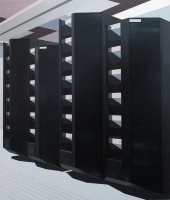
I want to say as clearly as possible that these paintings are completely different and luscious in person. To see them in reproduction is to not see them at all. Most of the larger works in Daniel Rich: Platforms of Powerare painted in acrylic on dibond. There are a couple that contain enamel as well. The main features of acrylic are the range of colors, its drying time and its flatness. These things conspire to make rather uninteresting surfaces or, worse yet, tend to make paintings that look like naugahyde. In Rich's hand the material has an amazing luminescence I have not seen in acrylic works - especially works at such an enormous scale. The paintings carry and emit so much light that they are in conversation of most of the large-scale light box photography of the past 25 years. The technical acumen and reserve of Rich's painting expose the tired bombast of that photographic work and posit a calculated and sustained intimacy that results in an overwhelming image. You don't wonder how Rich makes a painting, his methods are clear. What you do wonder about is the dizzying change in perception that has to take place between the painting each individual window in a North Korean hotel complex and seeing the overall green cast landscape. This shift, this dislocation, is how we experience our relationship to power and its hegemonic presence. In the presence of contemporary power, we have no indications of whom we are to worship, but we kneel just the same.
Because the subject of the work is the locus of power it is fitting that Rich's project makes us feel a sense of awe at modernist structures and the tools of capital. There is no way you will be able to look at a server farm of the colored seats in a stadium the same way after seeing these paintings; Rich makes the architecture of power downright sexy. It's as if the world was perfect (read: absent of humans), or re-imagined by Donald Judd's aesthetic sensibility. The oppressive nature of this vision is put into the sexy, sleek, elegant package of the paintings. Rich puts us in a position of looking desirously at the architecture of government, sport, data, and commerce. He heightens their interest with deft handling of color and surface, the tools any painter worth the name uses in the language of seduction. BT Tower London has a clear relationship to the work of Charles Sheeler, but Rich's articulation of modernist form is more about undulation than angle. His paintings touch the edges of their supports in inelegant ways that belie their source in photographs and provide a disruption where Sheeler offers balance. Rich is not painting markers of repression and balance. Like Patrick Bateman, the anti hero of Bret Easton Ellis's American Psycho, Rich's work is an expression of sexy perfection of unchecked power. This is powerful work to contemplate in this moment of OCCUPY, the 99%, the 47%, and the ongoing discussion of the nature of contemporary capitalism.
Al Miner has put together a handsome show. There are a lot of paintings here and there are some smaller scale works that are real gems. The fact that Miner has installed them as ancillary works is wise, they would have been overwhelmed by the other paintings in this installation, though in another space any one of the smaller works would hold the wall. It's nice to see a curator made a decision for the work that reveals an artist's range without making the show look like "greatest hits." (I'm also thrilled that all of the children's art is no longer in the contemporary wing for this show. I'm hoping it never comes back.)
The repetitive shapes of contemporary life become achingly endless color intervals that are supported by the stenciled precise drafting of the paintings. That their subtle gloss and gleam allows the reflected presence of the viewer to enter them briefly in no way diminishes the work. In fact, the paintings make you a ghost in the landscape of power, a sensuous world that excludes your body, and rewards your eyes.

